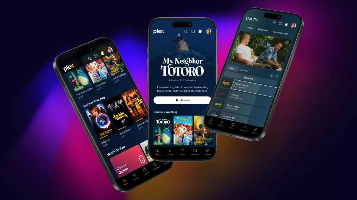
In an increasingly competitive streaming landscape, Plex is making waves with its bold redesign of both its media software and streaming service. Over time, the platform has successfully transitioned from a home media organization tool to a comprehensive streaming service, yet this evolution has not come without its challenges. The intricate balance between maintaining its home media roots and providing a sophisticated user experience is crucial, especially following a substantial $40 million fundraising effort at the start of 2024. With aspirations to achieve profitability by late 2024 or early 2025, Plex had to prioritize a user-friendly interface that enhances content discovery and personalization.
Plex’s newly introduced features signal a concerted effort to center user experience in its design philosophy. The previous reliance on traditional hamburger menus has been replaced with intuitive tab navigation that enables users to effortlessly switch between various segments of the service. With quick access to essential features such as their media library, live TV channels, and on-demand streams, users can now navigate the app with more fluidity than ever before. The organization of the app reflects a commitment to meet users’ needs, merging functionality with seamless design.
Highlighting the importance of personalization in the modern streaming arena, Plex’s redesign emphasizes bespoke navigation options. The inclusion of distinct buttons for essential sections such as a dedicated Discovery hub and personalized home page indicates that Plex values user engagement. By harnessing advanced algorithms to tailor content suggestions based on viewing habits and preferences, the app is tapped into the psychology of its users—making it easier for them to find relevant shows and movies tailored to their interests.
For loyal Plex users who continue to depend on the platform for home media management, the redesign does not overlook their needs. One of the standout features is the centralized access to the user’s media library, which is now more prominent than ever. Users can easily favorite their libraries, ensuring that their unique content collections remain easily accessible. This newfound emphasis on home media reflects an understanding that Plex’s core audience is not only interested in streaming but also appreciates the organization of their physical and digital media collections.
Additionally, the significant visibility given to the Watchlist feature—a function that tracks desired content—marks a shift toward recognizing user habits and preferences. As streaming consumption evolves, the importance of a well-structured watchlist becomes crucial, allowing Plex to foster loyalty among users while improving their viewing experience.
Technological aesthetics play a vital role in enhancing user engagement. Plex’s redesign goes beyond mere cosmetics; it presents an expanded visual language that elevates its movie and show detail pages, as well as users’ own profiles. The incorporation of title artwork and improved visuals for cast and crew profiles not only makes the interface more appealing but also responds to user feedback advocating for a richer visual experience. This strategy may help users remain immersed in their media experiences, reducing the chance of distraction and disengagement.
Moreover, the redesign reflects significant updates under the software’s hood. By streamlining the codebase, Plex ensures that new features can be rolled out across all platforms promptly. This agility in development allows for ongoing improvements driven by user feedback, adapting to an ever-evolving digital landscape.
While the redesign promises a myriad of benefits, Plex is strategically implementing a phased rollout. Initially available on mobile devices through an “early-access preview,” the company seeks to gather user insights and address potential issues before a full-scale launch. This phased approach demonstrates an awareness of the need for iterative improvements based on real user interaction.
Though several features like playlists and casting functions are still under development, prioritizing user feedback during this period will be critical in shaping the future of Plex. By tapping into their user community’s insights, Plex is positioning itself as a responsive player in the streaming arena, increasing its chances of achieving profitability and longevity in the marketplace.
In essence, Plex’s redesign encapsulates a blend of innovation and responsiveness to user demands. By prioritizing discovery, personalization, and visual enhancements—all while honoring its heritage as a home media organizer—Plex sets a course for a transformative future. As it embraces user feedback, the platform is not just adapting to change; it is proactively shaping how streaming services can evolve within a context that honors both user experience and technological advancement. With the right measures in place, Plex might indeed realize its ambition of profitability and further solidify its position in the ever-competitive streaming landscape.

